FRONTIER AIRLINES
Rebrand
Individual Final Design Internship Capstone, FCB Design Group
August 2025
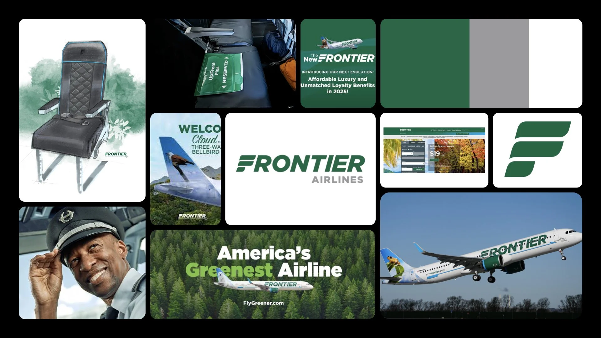
Original System

GROUNDED
#07442A

OPTIMISM
#C8EC6F

OPEN
#F5FFDC

PROGRESS
#D2D6FF

INTEGRITY
#2A1A73


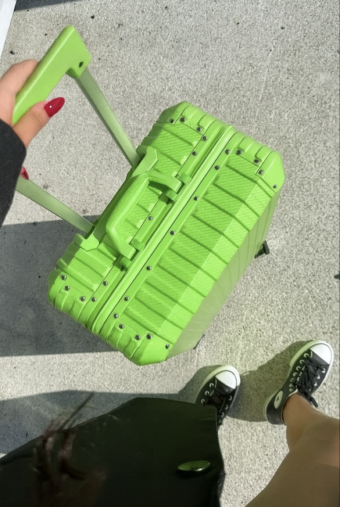


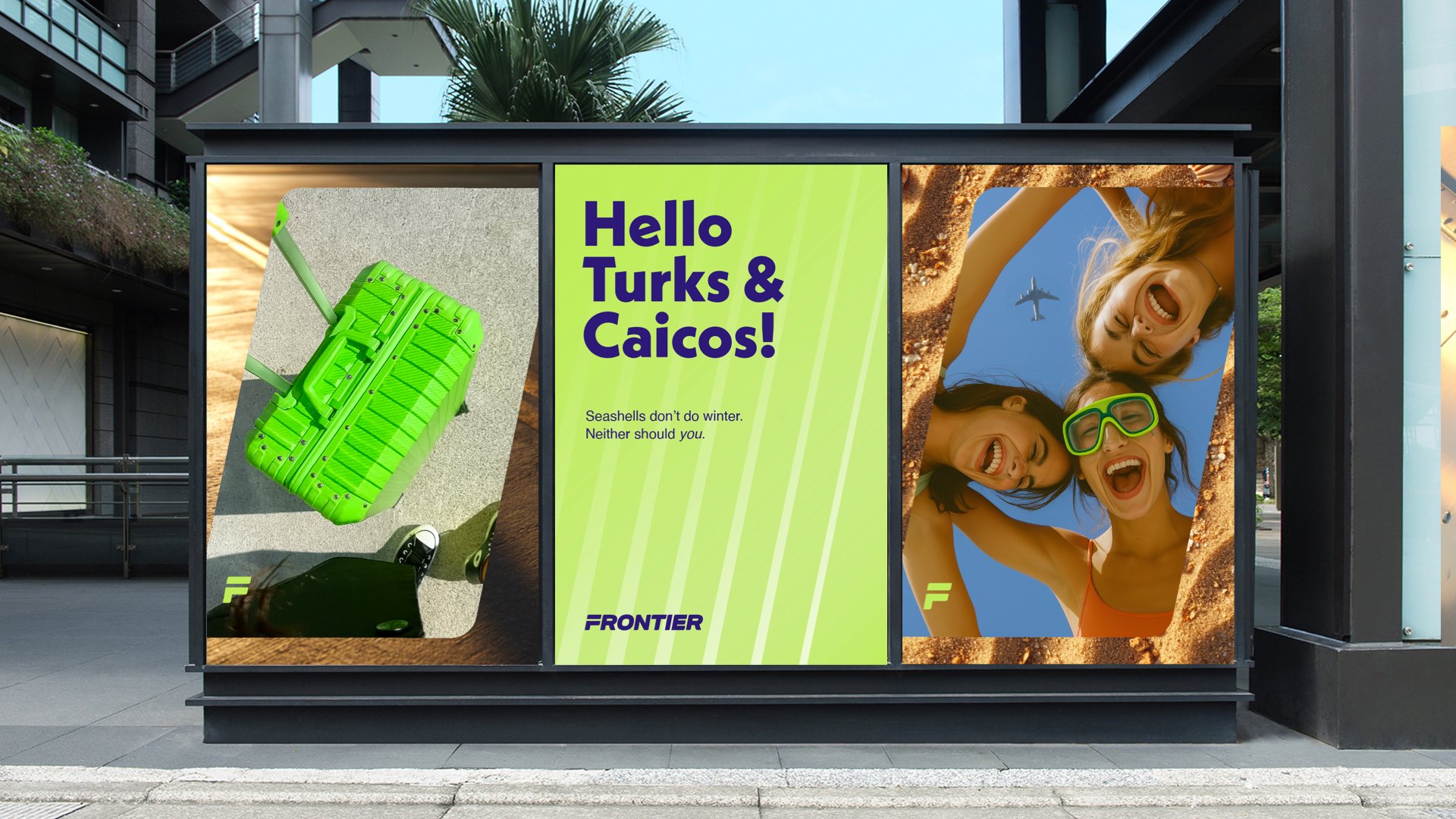
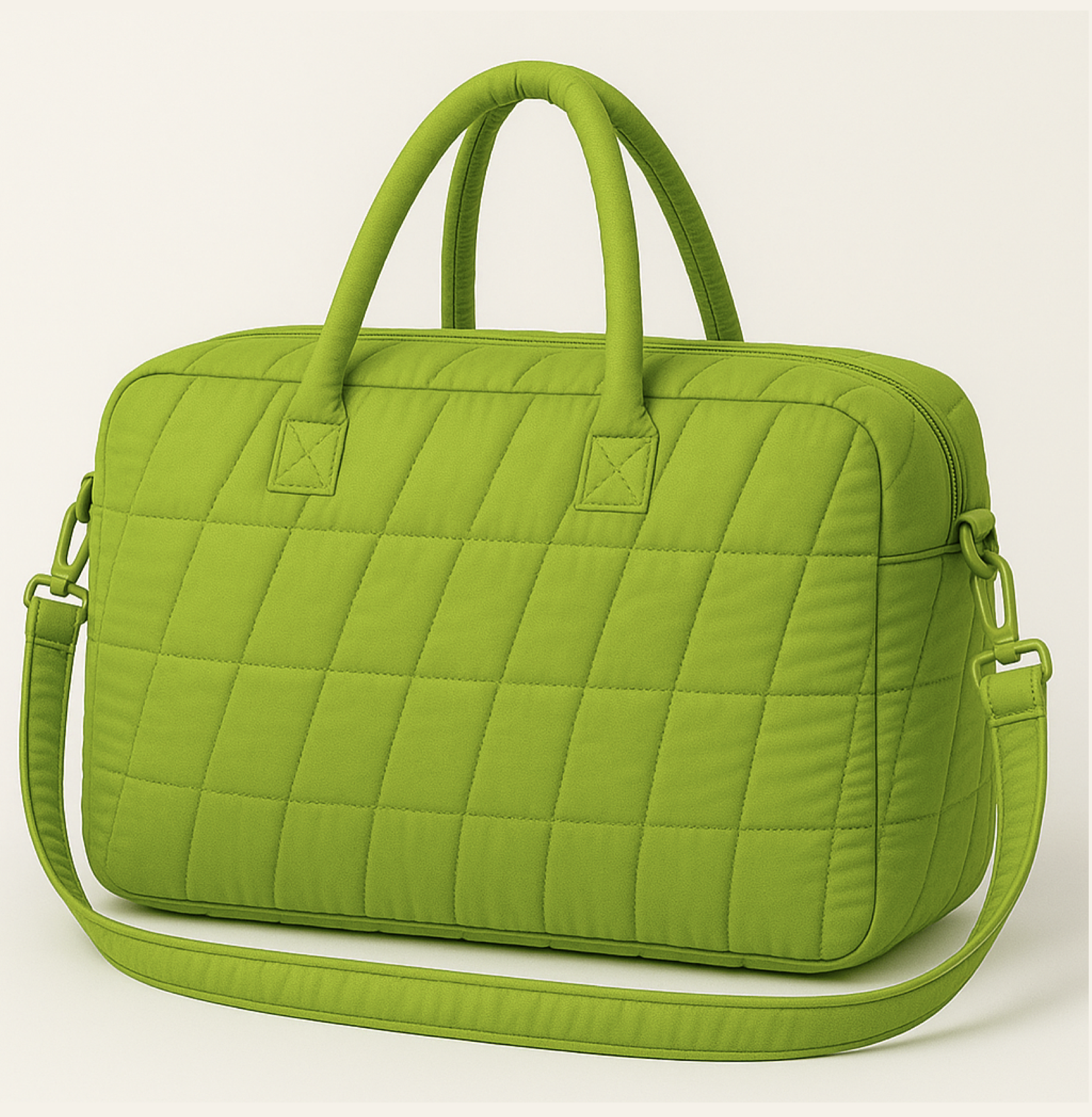
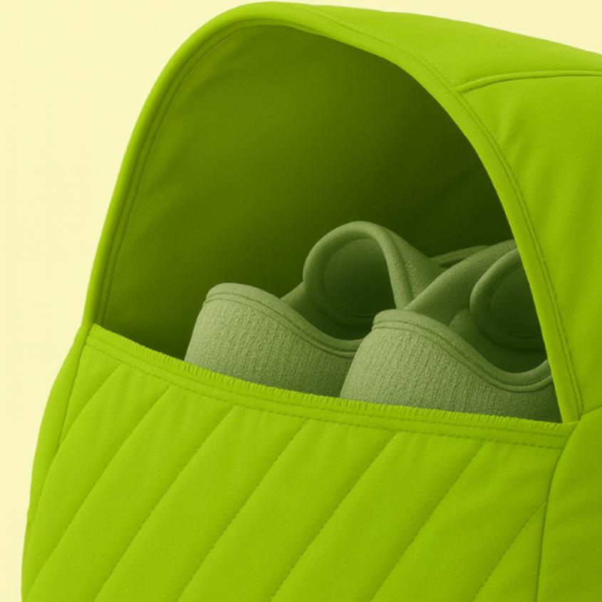
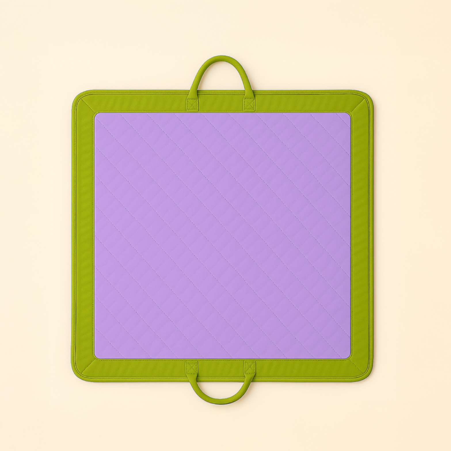
FRONTIER x BAGGU
Reflection
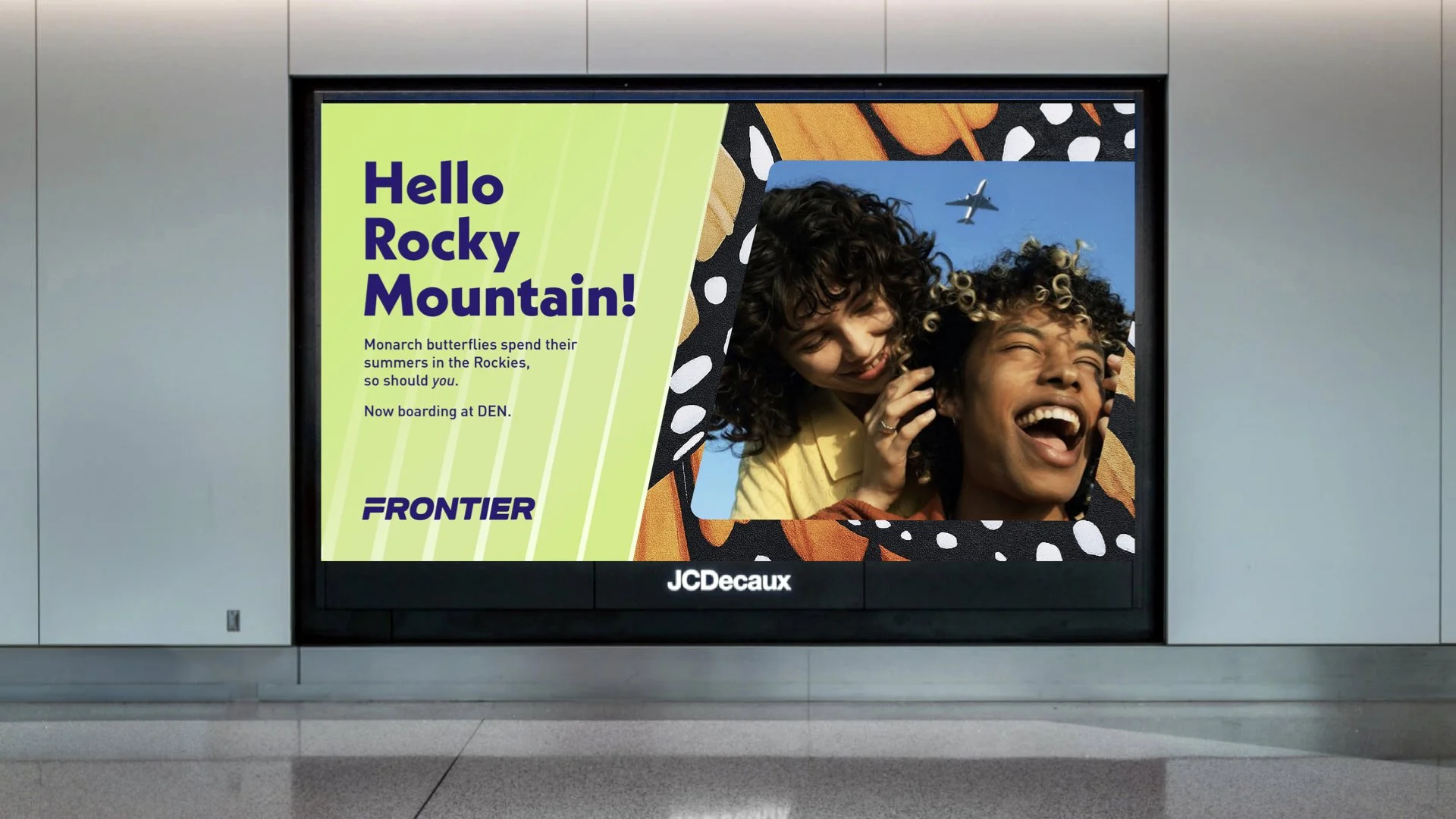
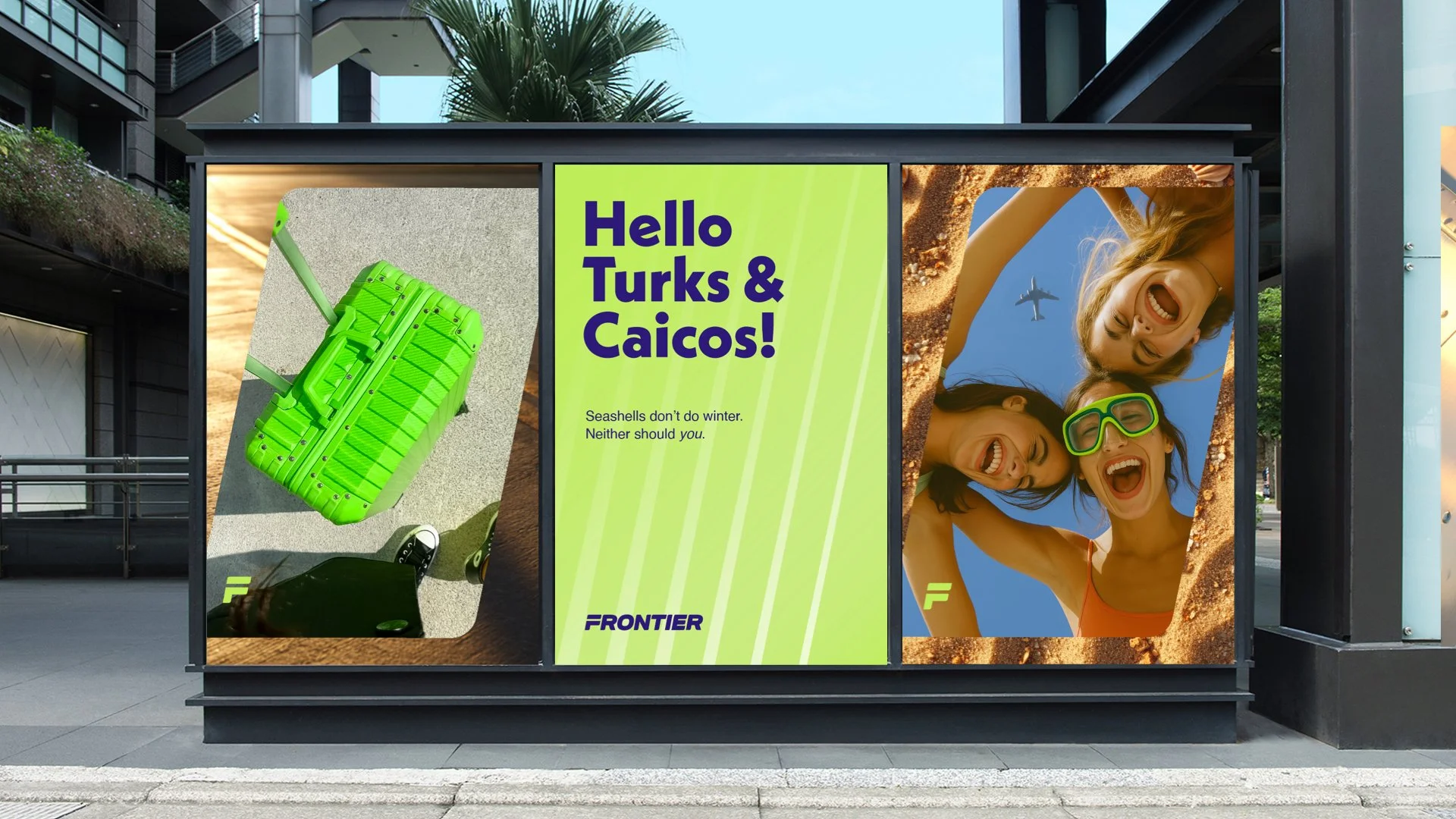
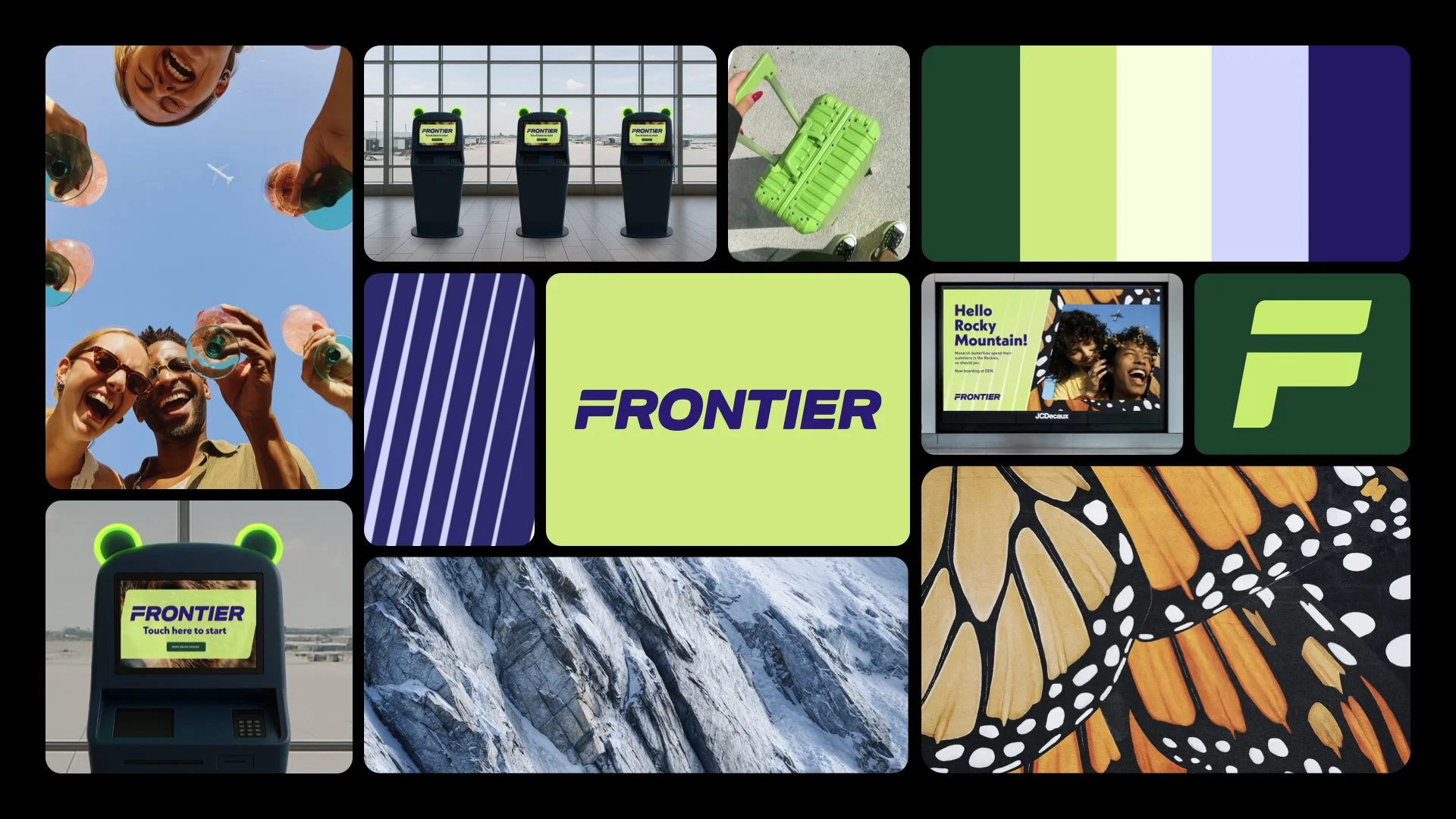
This project taught me how to design a brand as a holistic system, where a single gesture (the 10° tilt) could unify visuals, experiences, and storytelling. From rethinking photography rules to reimagining kiosks and travel accessories, I learned how branding extends beyond aesthetics into real touchpoints that shape how people experience a brand.
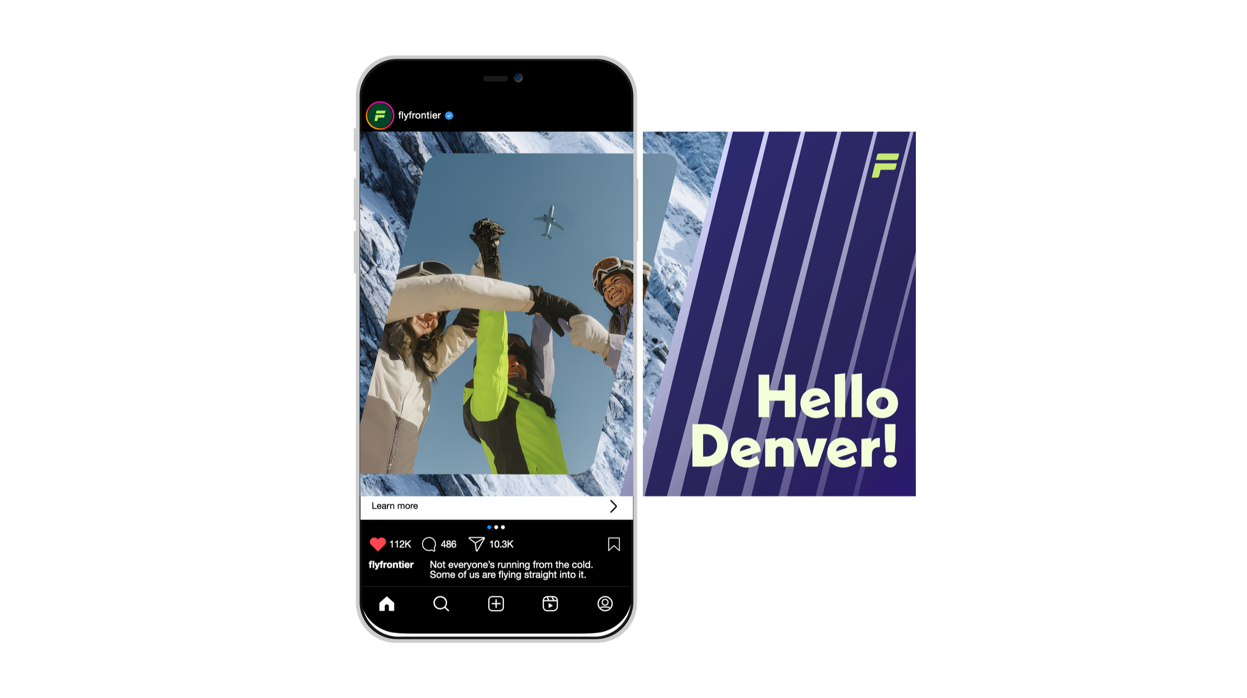
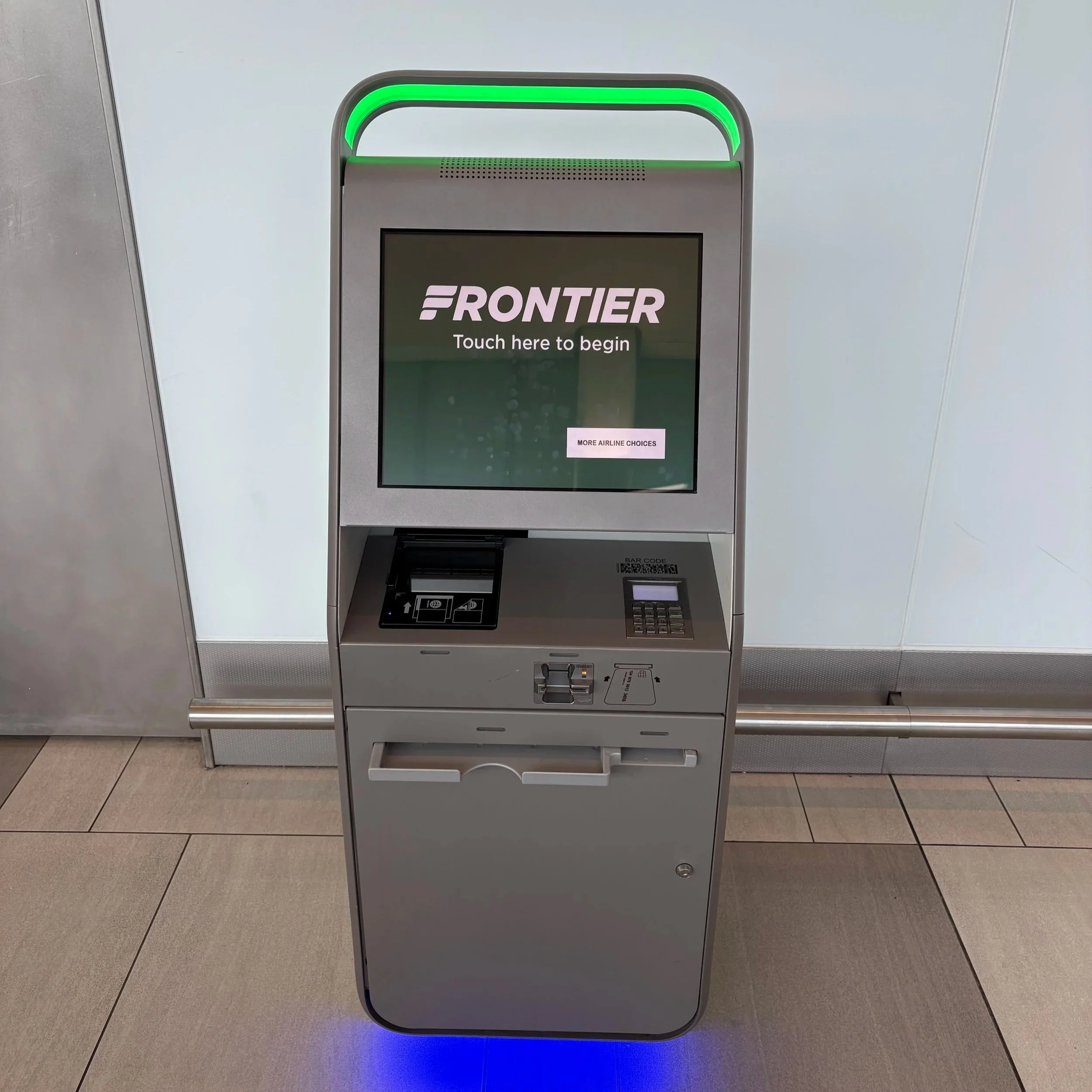
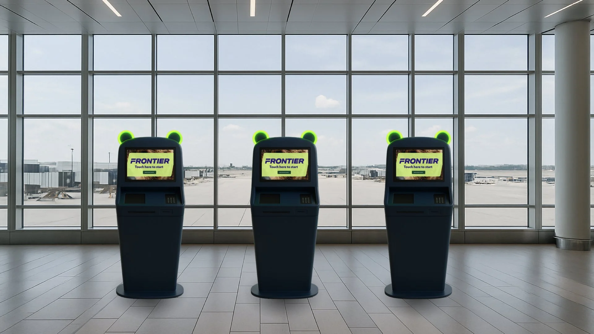
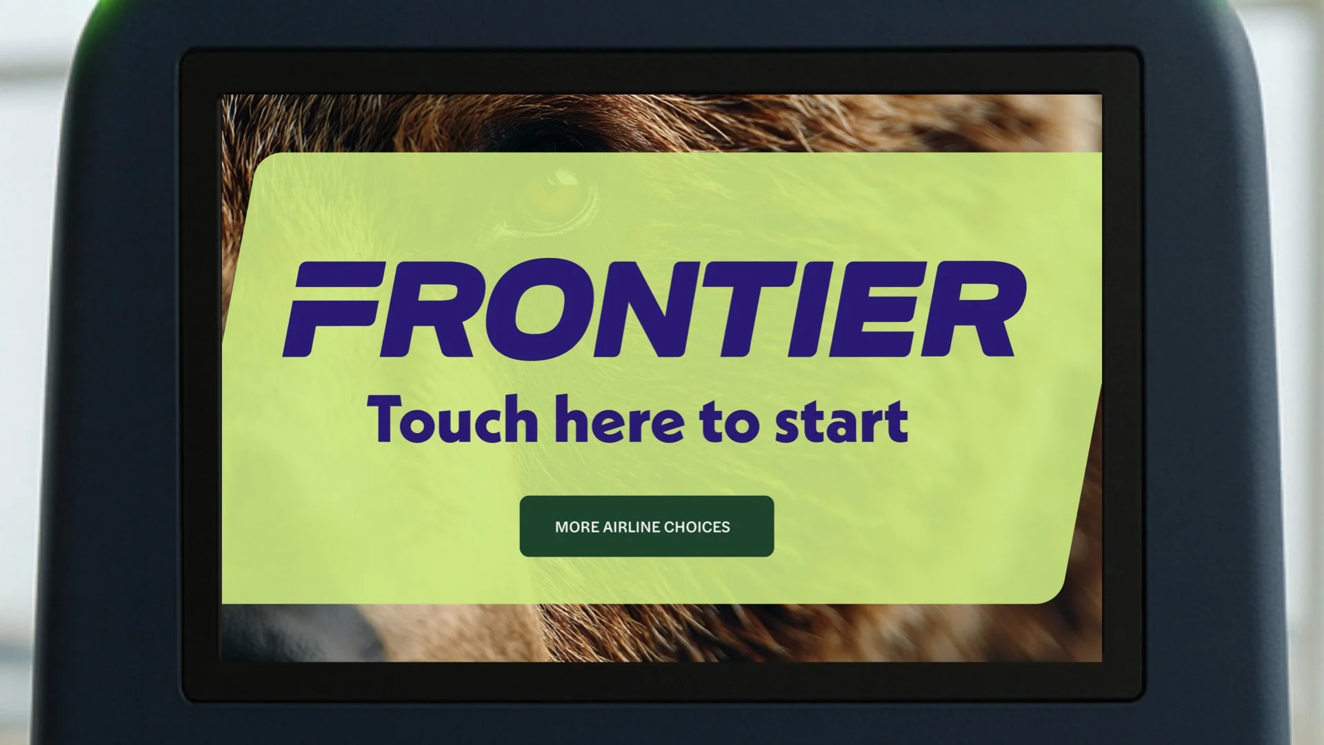
Before the rebrand, Frontier’s visual world leaned heavily on its environmental message, with a palette and tone that felt dependable but static. In reimagining it, I wanted to evolve that identity into something more human and energetic, a brand about the joy of travel rather than just its efficiency. The new system shifts from corporate to optimistic, replacing dark greens and greys with a bright lime and deep navy palette, layered textures, and candid, upward-facing photography that celebrates connection. The 10° tilt became symbolic for movement and optimism, bringing consistency across everything from airport kiosks to billboards. What was once functional now feels alive, expressive, and modern, a reminder that even low-cost travel can feel uplifting, inviting, and full of possibility.
Original System
Refreshed System
August 2025