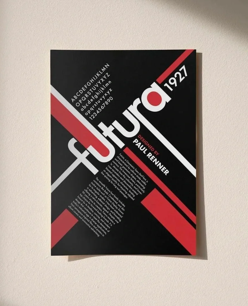
FUTURA
Type Specimen Poster
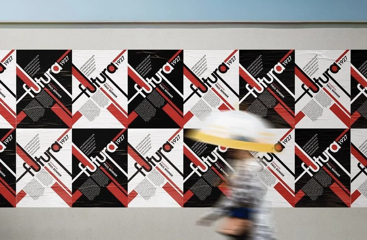
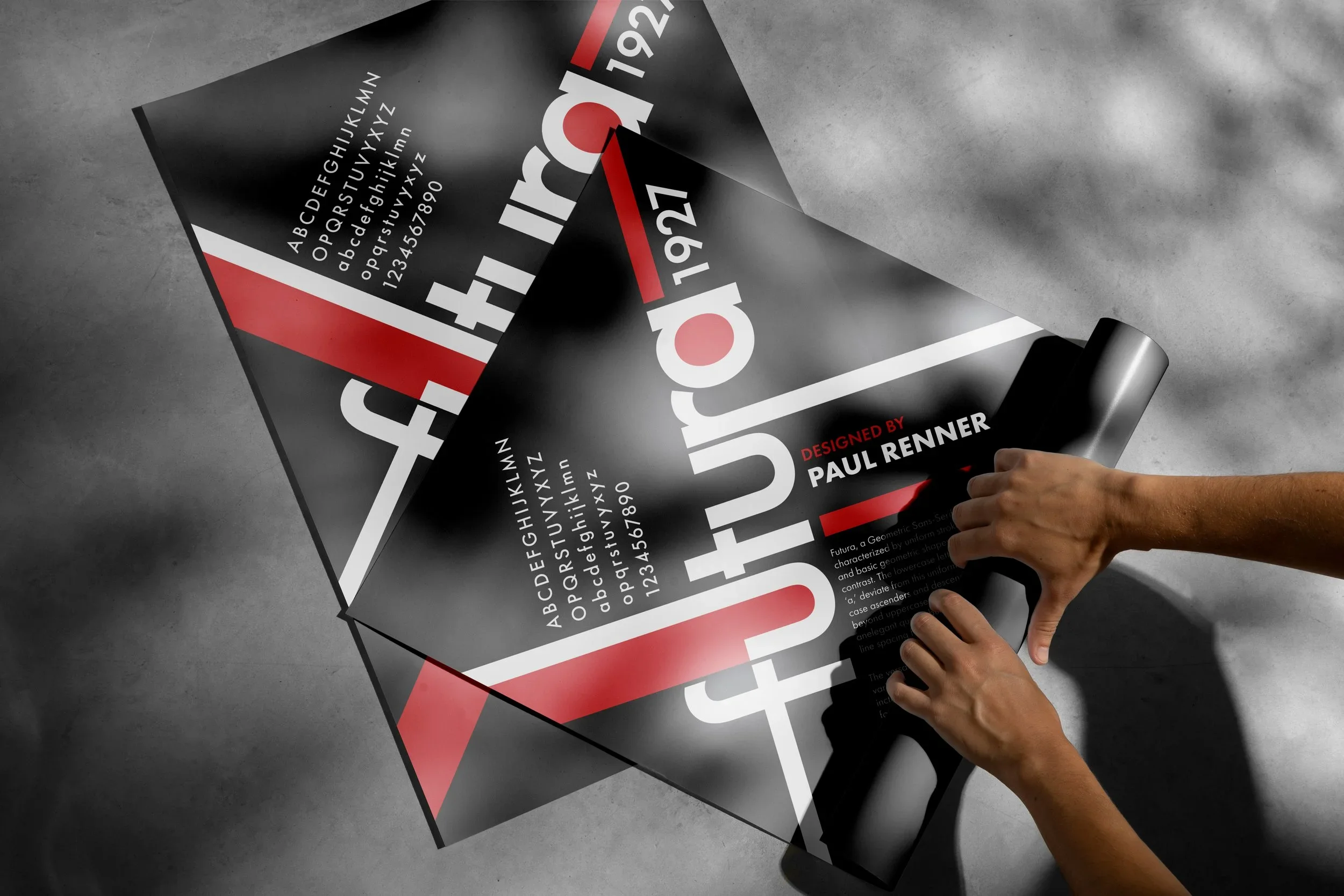
Created for my Visual Communication course, this project explores Paul Renner’s Futura through a Bauhaus-inspired lens. I was drawn to how Bauhaus design balances order and play, using clean geometry, bold color, and strong composition. I began by moodboarding its key visual languages like diagonal structure, contrast, primary color palette and repetition, then developed a layout that celebrates both the typeface’s precision and its personality.
The poster was designed in two colorways, black and white, to emphasize form and contrast, but the final version leans into the boldness of the black design. I focused on both type anatomy and layout rhythm, using sharp lines, modular grids, and hierarchy to guide the eye while keeping the energy and balance of modernist design.
Reflection
This project taught me how to merge historical inspiration with my own design voice. By studying Bauhaus principles and reinterpreting them through Futura, I learned how structure and creativity can work together to create something timeless and modern.